
Showing posts with label characters. Show all posts
Showing posts with label characters. Show all posts
Sunday, 29 October 2017
Inktober- Day 29- Censored Illustration


Sunday, 22 October 2017
Inktober- Day 22- Censored Illustration and Work in Progress


Thursday, 19 October 2017
Inktober- Day 19- Censored Illustrations and Sketches


Sunday, 15 October 2017
Inktober- Day 15- Censored Illustrations and Rough Sketches



Saturday, 14 October 2017
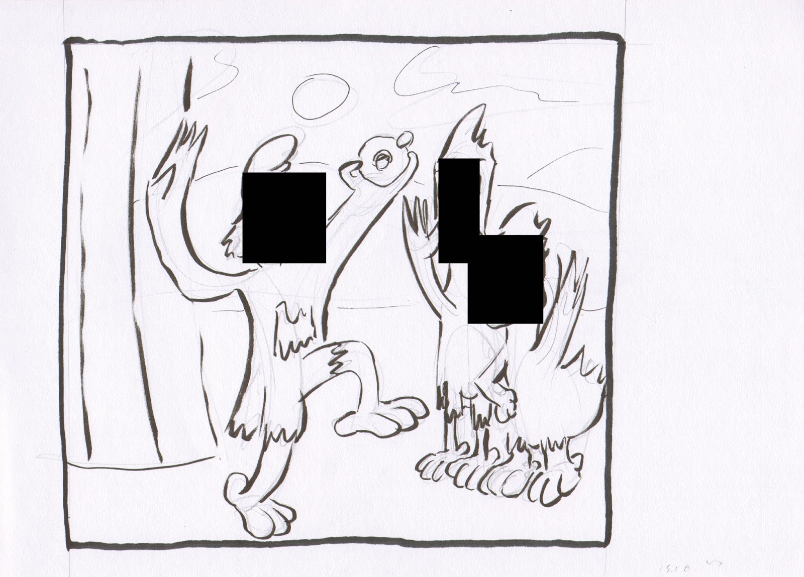
Inktober- Day 14- Censored Illustrations and Rough Sketches


Thursday, 12 October 2017
Inktober- Day 12- Rough Character Illustration

Friday, 6 October 2017
Inktober- Day 6- Pencil and Ink Illustrations


Sunday, 2 April 2017
Comic Display at Red Room Exhibition March 27th 2017
 |
| Comic Pages on Display |
 |
| Comics Display in Context with Other Images |
Whilst this has not been the first time my work has been on displayed, I am glad that they have taken a good place amongst the rest of the artwork, which looks very visually striking even when taken from a Smartphone. As for the comics themselves, I am surprised at how good the line of action is on the top page, featuring two characters interacting in three panels. I do not know if it is the choice of colours or how I have drawn them (although that bottom panel had been tinkered to get the final desired effect), but I was pleasantly surprised at how striking that very page is. Whilst the other two feature conversations, they seem cluttered from a distance. Therefore, people would have been able to read the pages for themselves closely.
Overall, I am always glad to see my work getting exposure in any way possible, and as I am still working on this project still, I will look forward to finalising the product, with the writer, at some point this year.
Sunday, 2 January 2011
Crowd Ilustration
I have decided for my New Year's resolution to do more creative stuff, like drawing, film-making, performing, and so on. So here is, hopefully, one of the many drawings I will do over the course of the year.
 It's an illustration depicting the hustle and the bustle of people in a small market town. I just wanted to do something out of the blue, rather then from a brief, or contest/challenge/art-jam. So I guess the illustration is a rough cluster of characters in a scene.

Monday, 14 April 2008
More William Wray
Here are some more pictures from a painter that I have introduced in an earlier post.


 Clouds, as well as other objects, can be used to create mood when it comes to lighting a piece. This picture uses clouds to darken this street painting; but we are given a supposed location of the light source by the bright blue sky in the top left corner of the painting.
 I quite like how light the colours are on this plane picture. This limited palette gives the plane a convincing perspective, and weight, within this scene. I should seriously consider using a much lighter palette to make my objects, or characters, stand out.


From his latest post, he has done an appealing painting, with such convincing anatomy to the characters, as well as some excellent lighting, and a solid understanding of weight. You get a good variety of sizes and shapes for the characters, like the small boy on the left, and, the centrepiece, a large woman sitting on chair. We get the notion of weight from the lighting- the boy's back is darkened by the light source, whilst the woman shines well a top, but gets darker as we go below the shoulders. Wray's comments reflect his preference to painting people with extreme proportions. This is good to note this when I will develop my own characters for future works by using a contrast of proportions on my characters to make them stand out.

I like the mood this picture brings. I also like the contrast between the lighting on all three sides on the piece. The one on the left is the darkest, bringing out the details on the stairway. The other wall is not too dark, but just has enough lighting to make it convincing, especially when you get down to the ladders and the drainpipe. The street scene, in the background, is very bright, using light colours to depict buildings; again, like on the walls, gets darker when you reach the road. It is always good to note what mood the backgrounds brings, especially when it comes to 2D animation, especially when layouts are concerned.
 Clouds, as well as other objects, can be used to create mood when it comes to lighting a piece. This picture uses clouds to darken this street painting; but we are given a supposed location of the light source by the bright blue sky in the top left corner of the painting.
 I quite like how light the colours are on this plane picture. This limited palette gives the plane a convincing perspective, and weight, within this scene. I should seriously consider using a much lighter palette to make my objects, or characters, stand out.
To finish off this post, I will finish on this simplistic painting of a train. The perspective is convincing because of the darkened areas of colour along the side of the train, and on the ground.
Subscribe to:
Posts (Atom)