Showing posts with label painting. Show all posts

Thursday, 13 July 2017

OxGrowArts Workshop Pieces- 22nd June 2017

After hesitating until the last minute, I decided to go to this Painting and Drawing Workshop organised by OxGrowArts, situated at Hogacre Common Eco Park in Oxford. Here are the drawings I made there, sit intact in my sketchbook before they are removed and framed for their exhibition at the end of July next month.

My first piece was probably my most successful piece from that workshop, calling it Flower Study. Basically, this is a still-life study of some flowers that feature some buds flowering more than others do. I just love how I went on a journey with my brush pen, getting lost in the detail of all those negative spaces and shapes this flower was making. I am not an expert in flowers, but it gave a pink/purple flower when the bud was in bloom. I was advised to try out adding some colour. Therefore, I did...


 After the acrylic omnishambles, I had time to do a quick study with my tried-and-tested brush pen, just called "Log." Therefore, I tried to sketch out this log near their pond. Not as convincing as my flower study, but I like the marks I made to frame the negative shapes that the leaves and log were forming. Not a complete disaster in my book, but something I should have spent more time establishing the objects in that space.


Sunday, 31 March 2013

Pieces Done Recently- January 2013 onwards

I thought I get around to sharing some of the other pieces I have worked on during this year. The above image was based on a exercise, in which I felt the object, but didn't see what the object was. My guess was correct, but I was able to illustrate the description of these cookie cutters in a conceptual way.


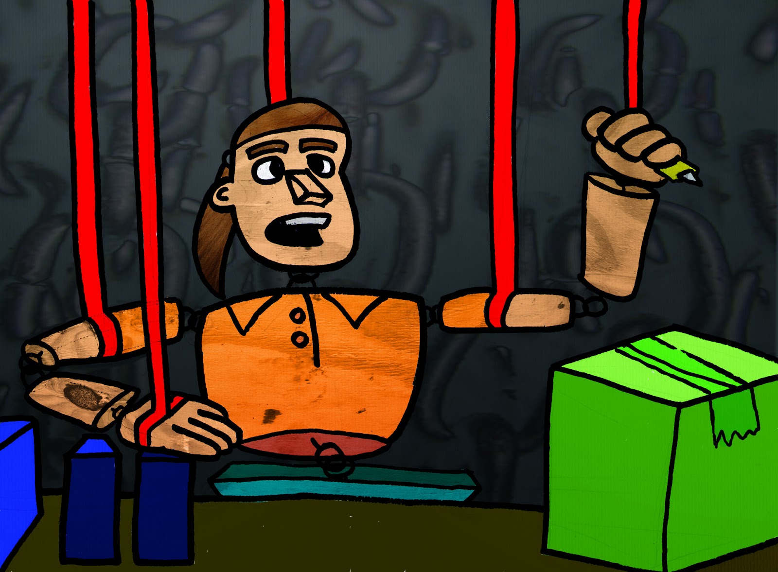
These images were done off-the-cuff back in January, based on a negative experience of packing for a popular toy company that have a local warehouse. I written a piece about the experience which uses the notion that I was 'orchestrated by red-tape'. So I guess it was natural to revisit this striking imagery of myself, as a puppet, with red tape as my strings. I loved how it came out.
I loved how this image came out during an exercise done this month. Think Akira Kurosawa (Seven Samurai, Yojimbo, Rashamon) meets Genndy Tartakovsky (Samurai Jack, Dexter's Lab), as I created this samurai illustration.

Thursday, 28 February 2013

Light and Dark Art Uploads- Paintings, Illustrations, and Wire Woman Studies


This is a batch of pieces done along the theme of light and dark. The paintings were based on scenes, and emotions, that I want to include inside my mask- and I won't be revealing my concepts behind this mask design just yet. The same can be said for the illustration of me on an exercise bike. The drawings all came from a still life drawing of this wire figure.

Monday, 2 January 2012

Imagery done in AS Art (2003-2004)- Pieces Done on the Theme of 'Home'

These are some of the pieces, done digitally and traditionally, that I did whilst on the theme of 'home'.
These two are just two classic examples of how not to use a simple filter facility in Photoshop .
This is only page I have scanned from my submitted sketchbook for assessment. It just show some photocopied images with some colour slapped on with some paint.
So from trying to make art out of photocopies, here is an actual painting, based on studying the works of Tracey Emin. So I really wasn't making that much original art during my time at college.

Monday, 14 April 2008

More William Wray

Here are some more pictures from a painter that I have introduced in an earlier post.

From his latest post, he has done an appealing painting, with such convincing anatomy to the characters, as well as some excellent lighting, and a solid understanding of weight. You get a good variety of sizes and shapes for the characters, like the small boy on the left, and, the centrepiece, a large woman sitting on chair. We get the notion of weight from the lighting- the boy's back is darkened by the light source, whilst the woman shines well a top, but gets darker as we go below the shoulders. Wray's comments reflect his preference to painting people with extreme proportions. This is good to note this when I will develop my own characters for future works by using a contrast of proportions on my characters to make them stand out.

I like the mood this picture brings. I also like the contrast between the lighting on all three sides on the piece. The one on the left is the darkest, bringing out the details on the stairway. The other wall is not too dark, but just has enough lighting to make it convincing, especially when you get down to the ladders and the drainpipe. The street scene, in the background, is very bright, using light colours to depict buildings; again, like on the walls, gets darker when you reach the road. It is always good to note what mood the backgrounds brings, especially when it comes to 2D animation, especially when layouts are concerned.

Clouds, as well as other objects, can be used to create mood when it comes to lighting a piece. This picture uses clouds to darken this street painting; but we are given a supposed location of the light source by the bright blue sky in the top left corner of the painting.

I quite like how light the colours are on this plane picture. This limited palette gives the plane a convincing perspective, and weight, within this scene. I should seriously consider using a much lighter palette to make my objects, or characters, stand out.

To finish off this post, I will finish on this simplistic painting of a train. The perspective is convincing because of the darkened areas of colour along the side of the train, and on the ground.

Tuesday, 22 January 2008

Timothy Horn

I have just stumbled on some excellent vehicle paintings from Timothy Horn (http://www.horndesign.com/) posted in a post William Wray's Blog.

http://williamwray.blogspot.com/2007/12/oil-can-show-news.html#links

I find this kind of work inspiring especially as I have to draw a vehicle in my comic for my portfolio, in which my main character drives in the comic. So seeing how vehicles get placed into urban setting, like this image above, really helps me understand how to integrate my vehicle, when it comes to lighting and shading.


I also find this picture fascinating because of Horn's ability to capture light on the metallic surface of this car.